In the world of e-commerce, a well-designed cart page can make all the difference. It can turn a hesitant shopper into a paying customer.
A cart page is crucial for online stores. It’s where customers review their items before checkout. Small design tweaks can lead to big changes in conversion rates. But what are these changes? This blog post will explore 29 cart page design elements that can boost your conversion rates.
From user-friendly layouts to trust-building features, we’ll cover everything you need to know. Whether you’re a seasoned e-commerce veteran or just starting out, these insights can help optimize your cart page. Get ready to enhance user experience and drive sales. Let’s dive in!
Table of Contents
ToggleClear Call-to-action
Having a clear call-to-action (CTA) on your cart page is crucial. It guides users to the next step, ensuring they don’t abandon their cart. A well-placed and visible CTA can significantly boost your conversion rates.
Primary Cta Placement
The primary CTA should be prominently placed. Position it above the fold, so users see it without scrolling. This ensures immediate visibility and encourages users to proceed.
Use contrasting colors for the CTA button. Make it stand out from the rest of the page elements. This draws attention and prompts action.
| Good Placement | Bad Placement |
|---|---|
| Above the fold | Below the fold |
| Near the cart summary | Hidden among text |
Secondary Cta Options
A secondary CTA offers users another action. It can be a link to continue shopping or save the cart for later. These options provide flexibility and improve user experience.
Keep the secondary CTA less prominent. Use a lighter color or a smaller button. This keeps the primary CTA as the main focus.
- Continue Shopping
- Save for Later
- Apply Coupons
Offering these options can reduce cart abandonment. It gives users control over their shopping experience.
Simplified Navigation
Simplified Navigation is crucial for a successful cart page design. It helps users move through the checkout process with ease. When navigation is clear and simple, it reduces confusion and cart abandonment. Let’s explore some key elements that can simplify navigation and boost conversion rates.
Breadcrumbs
Breadcrumbs show users their current location within the site. They provide a clickable path back through the steps they have taken. This clear navigation trail helps users feel in control. They can easily return to any previous page without losing their place.
- Helps users understand their location
- Provides a clear path back
- Reduces confusion and frustration
Back To Shopping Button
The Back to Shopping Button is a useful feature for cart pages. It allows users to return to the product listing with one click. This button can be a lifesaver for users who want to add more items to their cart.
| Feature | Benefit |
|---|---|
| One-click return to products | Easy navigation back to shopping |
| Visible button placement | Reduces cart abandonment |
Make sure this button is clearly visible and easy to find. Users appreciate the convenience of seamless navigation.
Progress Indicators
Progress indicators play a crucial role in enhancing the user experience on cart pages. They provide clear guidance and keep users informed about their current stage in the checkout process. This helps reduce anxiety and boosts confidence, leading to higher conversion rates.
Checkout Steps
Breaking down the checkout process into manageable steps is important. Users feel more comfortable when they know exactly what to expect. Each step should be clearly labeled, such as “Shipping Information” or “Payment Details”. This clarity ensures users remain engaged and less likely to abandon their carts.
Visual Progress Bars
Visual progress bars are highly effective in showing users their position in the checkout journey. They offer a visual representation of progress, making the process seem less daunting. A simple horizontal bar with segments for each step can do wonders. As users complete each step, the bar fills up, giving a sense of accomplishment.
Ensure the design is clean and easy to understand. Avoid clutter. Use contrasting colors to highlight the completed sections. This visual cue can significantly enhance user experience and drive conversions.
Trust Signals
Trust signals are vital for any cart page design. They reassure customers about their purchase decisions. Trust signals can significantly boost conversion rates. They help to build confidence in your online store.
Security Badges
Security badges are essential on a cart page. They show that your site is safe. Common security badges include SSL certificates and payment security icons. These badges assure customers that their personal data is protected.
- SSL Certificates: Show that transactions are encrypted.
- Payment Security Icons: Examples include Visa, MasterCard, and PayPal.
Displaying security badges near the payment section is crucial. Customers feel more secure entering their credit card details. A safe shopping environment encourages them to complete their purchase.
Customer Reviews
Customer reviews play a key role in building trust. They provide social proof from other shoppers. Positive reviews can influence new customers to buy. Include a section for customer reviews on your cart page.
| Review Element | Purpose |
|---|---|
| Star Ratings: | Quickly shows overall satisfaction. |
| Written Reviews: | Gives detailed feedback from past buyers. |
Showcase reviews from verified buyers. This adds authenticity and trust. Make sure to respond to reviews. Engaging with customers shows you care about their feedback.
Product Summaries
Product summaries are essential on your cart page. They provide customers with a brief, yet comprehensive overview of the items they are purchasing. Effective product summaries can significantly enhance user experience and boost conversion rates. Let’s dive into some key elements that make a strong product summary.
Itemized List
An itemized list is crucial for clarity. It allows customers to see all their selected items at a glance. This list should include the product name, a small image, price, and quantity.
| Product | Image | Price | Quantity |
|---|---|---|---|
| Product 1 |  |
$10 | 1 |
| Product 2 |  |
$20 | 2 |
This format helps customers easily verify their selections. It reduces the chances of errors and enhances trust.
Editable Quantities
Allowing customers to edit quantities directly on the cart page is vital. An editable quantity field offers flexibility and control.
- Customers can adjust the number of items without leaving the page.
- It helps in reducing friction during the checkout process.
- Easy adjustments can lead to higher order values.
For example, providing a small input box next to each item for quantity adjustments can make a big difference. It keeps the process seamless and user-friendly.
By focusing on these product summary elements, you can create a cart page that not only looks good but also performs well in terms of conversions.
Shipping Information
Shipping information is a critical part of the cart page. It directly influences the customer’s purchase decision. Clear and detailed shipping information can reduce cart abandonment. Let’s explore the key shipping elements that boost conversion rates.
Shipping Options
Offer multiple shipping options. Choices like standard, express, and overnight shipping cater to different needs. Highlight the benefits of each option. For example, express shipping ensures faster delivery. Standard shipping might be more affordable. Clearly list the shipping costs. This helps customers make informed decisions.
Estimated Delivery Dates
Providing estimated delivery dates builds trust. Customers want to know when to expect their order. Displaying dates reduces uncertainty. It also helps in planning. For instance, someone buying a gift needs to know it will arrive on time. Use real-time data to give accurate estimates. This enhances customer satisfaction and loyalty.
Payment Options
Providing various payment options on your cart page is vital for improving conversion rates. Customers feel more comfortable and secure when they have their preferred payment method available. Let’s explore two key aspects of payment options that can greatly enhance your cart page design.
Multiple Payment Methods
Offering multiple payment methods caters to a wider audience. Some customers prefer credit cards, while others might use PayPal or digital wallets.
- Credit and Debit Cards: Visa, MasterCard, AMEX
- Digital Wallets: Apple Pay, Google Wallet
- Online Payment Systems: PayPal, Stripe
- Bank Transfers
Include logos of these payment options to build trust. Display them prominently on the cart page.
Saved Payment Information
Allowing customers to save payment information speeds up the checkout process. Returning customers can complete their purchase with one click.
| Benefits | Details |
|---|---|
| Convenience | Quicker checkout process |
| Repeat Purchases | Encourages customers to return |
| Security | Stored information is encrypted |
Ensure the stored payment data is secure. Use encryption and comply with payment security standards.
Discount Codes
Discount codes on the cart page can motivate customers to complete their purchases. They create a sense of urgency and add value.
Discount codes play a crucial role in boosting conversion rates. They offer customers a sense of value and savings. This encourages them to complete their purchase. Implementing discount codes effectively can make a significant difference.Promo Code Field
A visible and easy-to-use promo code field is essential. Place it prominently on your cart page. Ensure it is simple to locate and use. Customers should not struggle to find where to enter their code. A smooth experience encourages them to apply discounts and complete their purchase.Automatic Discounts
Automatic discounts enhance user experience. They eliminate the need for manual code entry. Customers appreciate the convenience of automatic savings. This reduces cart abandonment rates. It also increases the likelihood of completing a purchase. A seamless discount experience can make a huge difference. “`Total Cost Transparency
Ensuring total cost transparency on the cart page is crucial for boosting conversion rates. Shoppers want to see a clear breakdown of all costs before completing their purchase. This transparency builds trust and reduces cart abandonment.
Itemized Costs
Display a detailed list of all items in the cart. Include the price of each item. Shoppers appreciate seeing exactly what they are paying for. This transparency helps them feel secure in their purchase decision.
Tax And Shipping Fees
Always show tax and shipping fees upfront. Include these costs in the cart summary. Transparency in these fees prevents unpleasant surprises at checkout. It also helps shoppers budget more accurately. This practice reduces the likelihood of cart abandonment.
Credit: optinmonster.com
Customer Support
Customer support is a critical element in any cart page design. It reassures customers that help is available if they need it. Good customer support can reduce cart abandonment and improve conversion rates. Here are some essential customer support features to include:
Live Chat
Live chat is an effective way to offer immediate assistance. Customers can get their questions answered in real-time. This reduces frustration and keeps them on the path to purchase.
- 24/7 availability: Ensure help is always accessible.
- Quick response times: Aim for under two minutes.
- Friendly and knowledgeable agents: They should know your products well.
Live chat boosts customer confidence. It shows you are there to help them.
Contact Information
Visible contact information is another key element. Customers should easily find ways to reach you. This can include phone numbers, email addresses, and physical addresses.
| Method | Details |
|---|---|
| Phone | Provide a toll-free number if possible. |
| Offer a dedicated support email address. | |
| Address | Include your physical location for trust. |
This information builds trust. It shows you are a real, reachable business. Make sure it is displayed prominently on your cart page.
Mobile Optimization
Mobile shopping is more popular than ever. To boost conversion rates, your cart page must be mobile-optimized. A well-optimized mobile cart page ensures a smooth and enjoyable shopping experience. This section will cover two key elements of mobile optimization.
Responsive Design
Responsive design is crucial. It ensures your cart page looks great on all devices. Whether customers use a smartphone, tablet, or desktop, the page should adjust seamlessly.
Use flexible grids and layouts. These help your design adapt to various screen sizes. Also, include scalable images. This prevents them from appearing distorted.
By implementing responsive design, you cater to a wider audience. This can lead to higher conversion rates.
Touch-friendly Buttons
Touch-friendly buttons enhance the mobile shopping experience. They make it easy for users to interact with your cart page.
Ensure buttons are large enough to tap. A minimum size of 44×44 pixels is recommended. This reduces the chance of misclicks.
Also, space buttons apart. This prevents users from tapping the wrong button. Use contrasting colors for buttons. This makes them stand out and easily identifiable.
By focusing on touch-friendly buttons, you create a user-friendly cart page. This can significantly improve conversion rates.
Guest Checkout
Guest Checkout allows customers to purchase without creating an account. This feature can significantly boost conversion rates. It simplifies the process and saves time.
Quick Checkout Option
A quick checkout option is essential for guest checkout. Customers prefer a streamlined process. They want to complete their purchase swiftly. Reducing the number of steps increases the likelihood of conversion. Ensure the checkout form is concise. Only ask for necessary information. This reduces friction and keeps customers engaged.
| Element | Benefit |
|---|---|
| Minimal Fields | Reduces time spent on checkout |
| Auto-fill Options | Speeds up the process |
| Progress Indicator | Shows steps remaining |
Account Creation Prompt
After a guest completes their purchase, prompt them to create an account. Offer incentives like discounts or faster checkout next time. This can turn one-time buyers into repeat customers.
- Post-purchase Sign-up: Ask customers to create an account after buying. This prevents distraction during checkout.
- Incentives: Offer discounts or rewards for account creation. This encourages customers to sign up.
- Easy Sign-up: Keep the sign-up process simple. Use the information they already provided.
In summary, the guest checkout feature can greatly improve your cart page. A quick checkout option and an account creation prompt can boost conversion rates. Implement these elements for a better user experience.
Saved Carts
Saved carts provide a convenient way for customers to return to their shopping. They can continue where they left off without losing their chosen items. This feature can significantly enhance the user experience and boost conversion rates.
Save For Later
The “Save for Later” option allows customers to store items they are not ready to purchase. They can easily move products from their cart to a saved list. This prevents cart abandonment and keeps customers engaged.
Customers appreciate the flexibility to revisit their saved items. This feature ensures they do not have to search for products again. It also helps in planning future purchases. By offering this convenience, you can improve customer satisfaction.
Wishlist Integration
Wishlist integration allows users to add items they like to their wishlist. This keeps the cart uncluttered and well-organized. Customers can manage their desired products more efficiently. They can decide later which items to buy.
Wishlists also enable better tracking of customer preferences. You can send targeted promotions based on their wishlist items. This enhances the likelihood of conversions. It encourages customers to return and complete their purchases.
Visual Appeal
Visual appeal plays a crucial role in boosting cart page conversion rates. A visually appealing cart page can make the shopping experience more enjoyable and encourage users to complete their purchases. Let’s dive into two key elements that contribute to the visual appeal of a cart page: a clean layout and high-quality images.
Clean Layout
A clean layout ensures users can easily navigate the cart page. It helps them focus on the important details without distractions. Here are some tips for creating a clean layout:
- Use plenty of white space to avoid clutter.
- Ensure a logical flow from product details to the checkout button.
- Highlight essential elements like the total price and checkout button.
- Use readable fonts and appropriate font sizes.
A well-organized layout makes the cart page look professional and trustworthy. This can significantly improve the user’s confidence in completing the purchase.
High-quality Images
High-quality images can greatly enhance the visual appeal of the cart page. Here are some tips for incorporating images effectively:
- Use high-resolution images that clearly show the products.
- Include multiple images to show different angles of the products.
- Ensure images load quickly to avoid frustrating delays.
- Make images clickable for a larger view, if possible.
Clear and attractive images can help users feel more confident about their choices. They can also reduce the likelihood of cart abandonment.
In summary, a clean layout and high-quality images are essential components of a visually appealing cart page. By focusing on these elements, you can create an engaging and user-friendly experience that boosts conversion rates.
Error Handling
Effective error handling on a cart page is crucial. It ensures a seamless user experience. Shoppers often abandon their cart due to unresolved errors. Addressing these issues can significantly boost conversion rates.
Clear Error Messages
Providing clear error messages helps users understand what went wrong. Vague messages cause frustration and lead to cart abandonment. Ensure your error messages are specific and direct.
- Use simple language.
- Highlight the field with the error.
- Provide a solution or next step.
For example:
| Vague Message | Clear Message |
|---|---|
| “Invalid input” | “Please enter a valid email address.” |
| “Error” | “Your password must be at least 8 characters long.” |
Recovery Options
Offering recovery options helps users correct errors quickly. This reduces frustration and keeps them on track. Provide guidance on how to fix the issue.
- Show a clear path to correct errors.
- Offer help links or tooltips.
- Allow users to save their progress.
For example:
- Display a help icon next to the error message.
- Provide a link to reset their password.
- Enable autosave to prevent data loss.
By implementing these elements, you create a smoother experience. Users can quickly resolve issues and continue with their purchase. This leads to higher conversion rates and increased sales.
Exit-intent Popups
Exit-intent popups are powerful tools to reduce cart abandonment. These popups appear when users are about to leave your site. They grab attention and encourage users to complete their purchase.
Discount Offers
Offer a discount to entice shoppers to stay. A small percentage off can make a big difference. Users love to save money. Highlight the discount clearly in the popup. This can be the push they need to complete their purchase.
Abandoned Cart Reminders
Remind users about items in their cart. People often get distracted or forget. A gentle reminder can bring them back. Include product images and details in the popup. Make it easy for them to resume their purchase. Keep the message friendly and helpful.
Social Proof
Social proof is a powerful tool for increasing conversion rates on your cart page. It builds trust and confidence in potential buyers. When customers see that others have had positive experiences with your products, they are more likely to complete their purchases. Below are some key elements of social proof that you can incorporate into your cart page design.
Customer Testimonials
Displaying customer testimonials on your cart page can significantly boost trust. Positive feedback from satisfied customers helps to reassure new buyers about their purchase decisions.
- Include short, impactful quotes from real customers.
- Show the name and photo of the customer to add authenticity.
- Highlight specific benefits or features of the product mentioned in the testimonial.
For example, a customer testimonial might read: “I love this product! It has made my life so much easier. – Jane Doe.”
User-generated Content
User-generated content (UGC) provides a more relatable and authentic perspective on your products. This could include photos, videos, or reviews created by your customers.
- Encourage customers to share their experiences on social media.
- Display these posts on your cart page.
- Use a hashtag for easy collection of user content.
For instance, you could create a section on your cart page that showcases real customer photos with your products, along with their comments. This not only adds credibility but also engages potential buyers by showing them how others are enjoying your products.
Incorporate these social proof elements into your cart page design to enhance trust and boost conversion rates.
Urgency And Scarcity
Creating a sense of urgency and scarcity on your cart page can significantly boost conversion rates. This strategy taps into the psychological triggers that compel customers to act quickly. By incorporating these elements, you can motivate customers to complete their purchases, reducing cart abandonment.
Limited Time Offers
One effective way to instill urgency is through limited time offers. Displaying a countdown timer on the cart page creates a sense of urgency. Customers feel the need to complete their purchase before the offer expires.
- Use a bold and noticeable timer.
- Highlight the benefits of completing the purchase now.
- Ensure the offer is genuinely time-limited to maintain trust.
Here’s an example of a limited time offer:
Hurry! Offer ends in:
Stock Availability
Displaying stock availability can create a sense of scarcity. Customers are more likely to act if they know an item is about to sell out.
| Item | Stock Status |
|---|---|
| Product A | Only 3 left in stock! |
| Product B | In stock |
Tips for showing stock availability:
- Use contrasting colors for low stock alerts.
- Keep the language clear and urgent.
- Update stock information in real-time.
Example of stock availability message:
Loyalty Rewards
Integrating loyalty rewards into your cart page design can significantly boost conversion rates. Customers appreciate feeling valued and rewarded for their loyalty. Let’s dive into two effective loyalty reward strategies that can enhance your cart page: Points System and Member Discounts.
Points System
A points system encourages repeat purchases by rewarding customers with points for every transaction. These points can be redeemed for discounts or free products. Here’s how you can effectively implement a points system:
- Clearly display the points earned for the current purchase on the cart page.
- Provide a simple explanation of how the points system works.
- Show the total points accumulated so far and what they can be redeemed for.
This transparency motivates customers to complete their purchase to earn more points. It also encourages them to return for future purchases to use their points.
| Purchase Amount | Points Earned |
|---|---|
| $10 | 10 Points |
| $50 | 50 Points |
| $100 | 100 Points |
Member Discounts
Member discounts are another powerful loyalty reward. Offering exclusive discounts to members can increase conversion rates and customer retention. Here are some tips for integrating member discounts:
- Highlight the member discount on the cart page prominently.
- Provide a clear call-to-action for customers to sign up or log in to access the discount.
- Show the original price and the discounted price to emphasize the savings.
This approach not only increases the perceived value of the purchase but also encourages non-members to join your loyalty program. It creates a sense of exclusivity and belonging.
Implementing these loyalty rewards into your cart page design can lead to higher conversion rates and more satisfied customers.
Cross-selling
Cross-selling on the cart page can significantly boost your conversion rates. It encourages customers to purchase additional items related to their original selection. By presenting these options, you can increase the average order value. Let’s delve into two powerful cross-selling techniques: Related Products and Frequently Bought Together.
Related Products
Showcase items that complement the customer’s chosen product. For example, if they added a camera to their cart, suggest a tripod or a camera bag. This technique helps customers discover products they might need but didn’t think about.
Use images and clear titles to make these suggestions attractive. Highlight key features and benefits. Ensure the related products are relevant to increase the chances of additional purchases.
Frequently Bought Together
Display products that other customers often buy with the item in the cart. This strategy relies on social proof. It tells customers that others found these items useful together.
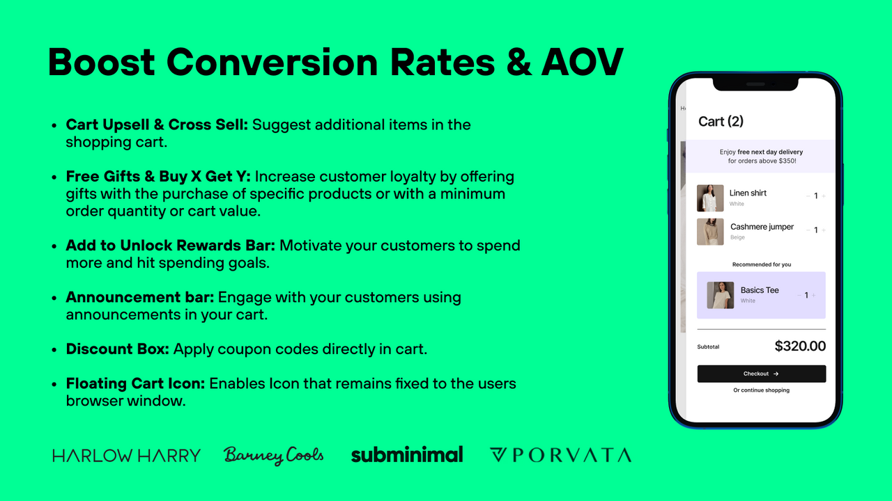
For instance, if someone buys a laptop, suggest a mouse or a laptop sleeve. Make sure these suggestions are based on actual purchase data. This makes the recommendations more credible and appealing.
Place these suggestions near the checkout button. This positioning makes it easy for customers to add them without disrupting the checkout flow.
Easy Returns
Creating an easy returns process can significantly boost your cart page conversion rates. Customers feel more confident making a purchase if they know they can return items without hassle. This trust can turn visitors into loyal buyers. Let’s explore two crucial elements of an easy returns process: the return policy and the return process.
Return Policy
Ensure your return policy is clear and simple. Use plain language. Avoid legal jargon. State the number of days customers have to return items. Mention any conditions, such as the item needing to be unused. Provide information about refunds or exchanges. Highlight any costs associated with returns, like restocking fees or shipping charges. Make sure this policy is easy to find on your site. Consider adding a link to it on the cart page. Transparency builds trust and reduces doubts during the buying process.
Return Process
A smooth return process is crucial. Simplify the steps customers need to take. Provide a straightforward way to start a return. This could be through an online form or a customer service number. Offer clear instructions on how to pack and send back items. If possible, provide a prepaid return label. Keep customers updated on the status of their return. An easy return process can turn a potentially negative experience into a positive one.
Personalization
Personalization can transform a cart page into a dynamic shopping experience. It caters to individual user needs, making the process more intuitive and engaging. By using personalization, businesses can significantly boost conversion rates. It creates a sense of connection and understanding between the brand and the customer.
Personalized Recommendations
Personalized recommendations can enhance the user experience. They suggest products based on previous purchases or browsing history. This method helps users find items they are more likely to buy. It makes shopping efficient and enjoyable.
Displaying related products on the cart page can increase average order value. Customers feel understood and valued. They see items that match their tastes. It reduces the effort needed to find complementary products.
User Preferences
User preferences play a crucial role in personalization. Saving user preferences can streamline the shopping process. It allows users to pick up where they left off. They do not need to re-enter information. This convenience can lead to higher conversion rates.
Offering options that align with user preferences shows that a brand cares. It builds trust and loyalty. Customers are more likely to return when they feel a brand understands their needs.
Accessibility
Accessibility is crucial for a successful cart page design. It ensures all users can navigate and complete their purchases without any barriers. By focusing on accessibility, you can significantly boost your conversion rates. Let’s explore two vital elements of accessibility: keyboard navigation and screen reader compatibility.
Keyboard Navigation
Keyboard navigation allows users to move through your cart page using their keyboard. This is essential for users with mobility impairments. Ensure all interactive elements like buttons and links are reachable via the Tab key. Provide clear visual indicators for focused elements. This helps users understand their current position on the page.
Screen Reader Compatibility
Screen reader compatibility makes your cart page accessible to visually impaired users. Screen readers convert text to speech or braille. Use semantic HTML elements like headings, lists, and buttons. Add alt text to images and ARIA labels to interactive elements. This helps screen readers convey the right information to the user.
Credit: apps.shopify.com
Analytics Integration
Analytics integration is vital for understanding your customers. It helps you track and analyze user behavior on your cart page. With the right data, you can make informed decisions to boost conversion rates. Let’s dive into key aspects of analytics integration.
Tracking User Behavior
Tracking user behavior shows how visitors interact with your cart page. You can see where they click and how long they stay. This data helps identify pain points. You can then address these issues to improve the user experience.
Use tools like Google Analytics. Track metrics such as cart abandonment rates and average session duration. These insights help optimize the cart page design for better performance.
A/b Testing
A/B testing involves comparing two versions of your cart page. You can test different design elements to see which performs better. For example, try different button colors or layouts. Measure the impact on conversion rates.
Use A/B testing tools to run experiments. Analyze the results to find the most effective design. This helps you make data-driven decisions to enhance the cart page.
Load Speed
Load Speed is a crucial factor in enhancing the cart page experience. A faster load time directly impacts user satisfaction and conversion rates. Slow loading cart pages can frustrate customers, leading them to abandon their carts. By optimizing load speed, you create a smooth and efficient checkout process.
Optimized Images
High-resolution images can slow down the load speed. Ensure images are optimized without compromising quality. Use formats like JPEG for photographs and PNG for graphics with transparency.
- Compress images to reduce file size.
- Use responsive images to adapt to different devices.
- Implement lazy loading to load images only when visible.
Minimized Scripts
Excessive scripts can delay the cart page load. Reduce the number and size of JavaScript and CSS files.
| Method | Description |
|---|---|
| Minification | Remove unnecessary characters from code. |
| Asynchronous Loading | Load scripts in the background. |
| Deferred Loading | Delay loading scripts until necessary. |
Use these methods to speed up your cart page. A faster load time keeps customers happy and reduces cart abandonment.
Localization
Localization is vital for e-commerce websites looking to boost conversion rates. It involves tailoring the cart page design to meet the cultural and linguistic needs of different users. This ensures that your website feels more personal and easy to use for a global audience. Here, we will discuss two critical elements: Multi-Language Support and Currency Conversion.
Multi-language Support
Multi-language support helps in reaching a broader audience. It allows users to interact with your website in their preferred language. This reduces confusion and increases the likelihood of completing a purchase. According to various studies, users are more likely to buy from a site that speaks their language.
Implementing multi-language support can be done through:
- Language Dropdown: A dropdown menu for users to select their preferred language.
- Auto-Detection: Automatically detect the user’s language based on their browser settings.
- Manual Translation: Employ human translators for more accurate translations.
Currency Conversion
Currency conversion is another crucial element that can significantly impact conversion rates. Shoppers feel more comfortable and are more likely to complete a purchase if they can see prices in their local currency. It removes the need to do mental calculations and reduces the friction in the buying process.
Effective currency conversion can be implemented through:
- Automatic Conversion: Use IP geolocation to automatically display prices in the local currency.
- Currency Selector: Allow users to manually select their preferred currency from a dropdown.
- Real-Time Rates: Ensure conversion rates are up-to-date to reflect real-time market conditions.
By focusing on localization elements like multi-language support and currency conversion, you can create a more inclusive and user-friendly shopping experience. This, in turn, helps in boosting your conversion rates.
Consistent Branding
Consistent branding is crucial for your cart page design. It helps build trust and recognition. Shoppers feel more secure when they see familiar elements. This can significantly boost conversion rates. Let’s explore two key components: brand colors and logo placement.
Brand Colors
Using your brand colors on the cart page is essential. It maintains visual consistency. Shoppers can easily connect the cart page with your brand. This connection builds trust and loyalty.
- Ensure all buttons use the same color scheme.
- Highlight important actions with a primary brand color.
- Keep background and text colors consistent with your website.
Consistent use of brand colors creates a cohesive look. It reassures shoppers they are still on your site. This reduces cart abandonment.
Logo Placement
Proper logo placement is vital for cart page design. Your logo should be easily visible. It reminds shoppers of your brand’s reliability.
| Placement | Effect |
|---|---|
| Top-left corner | Increases brand recall |
| Top-center | Enhances visual balance |
| Top-right corner | Maintains consistency with other pages |
The logo should be clickable. It should link back to the homepage. This provides easy navigation for shoppers.
Consistent branding, through colors and logo placement, is key. It builds trust and ensures a seamless shopping experience.

Credit: apps.shopify.com
Legal Compliance
Ensuring legal compliance on your cart page is crucial. It builds trust and protects your business. Clearly stated policies can help boost conversion rates by making customers feel safe and informed. Here are some key elements to include:
Privacy Policy
Your privacy policy must be clear and accessible. It should explain how you collect, use, and protect customer data. This transparency reassures customers that their information is safe. It can also improve their willingness to complete a purchase.
Consider placing a link to your privacy policy in the footer or near the checkout button. This makes it easy for users to find and review it.
| Key Points | Details |
|---|---|
| Data Collection | Explain what data you collect and why. |
| Data Usage | Describe how you use the data. |
| Data Protection | Outline your data protection measures. |
Terms And Conditions
Your terms and conditions outline the rules for using your website. They set expectations for both your business and your customers. Clear terms and conditions can prevent disputes and build trust.
Include a link to your terms and conditions on the cart page. Place it near the checkout button. This ensures customers can easily access and review them before completing their purchase.
- Return and refund policies
- Shipping information
- Payment terms
- Liability limitations
These elements are essential for a transparent and trustworthy shopping experience.
Frequently Asked Questions
What Are Essential Cart Page Design Elements?
Essential cart page design elements include a clear layout, prominent call-to-action buttons, trust badges, and easy navigation.
How Can Trust Badges Improve Conversion Rates?
Trust badges increase customer confidence in the transaction, leading to higher conversion rates and reduced cart abandonment.
Why Is Easy Navigation Important In A Cart Page?
Easy navigation ensures a smooth user experience, reducing frustration and making the checkout process quicker and more efficient.
What Role Do Call-to-action Buttons Play?
Call-to-action buttons guide users towards completing their purchase, making the checkout process intuitive and straightforward.
Conclusion
Every detail on your cart page matters. Small changes can make a big impact. Clear calls-to-action, simple navigation, and trust signals increase conversions. Test different elements to see what works best. Keep the design clean and user-friendly. Prioritize the customer experience.
With these 29 elements, your cart page can boost conversion rates. Happy optimizing!

